This project explores what a logo could look like if Dallas, TX were chosen to host the Olympics following official branding guidelines.
Primary goal is to capture the heart of Dallas, TX and the sense of unity the Olympic games bring
Ideation/Empathize
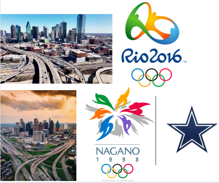
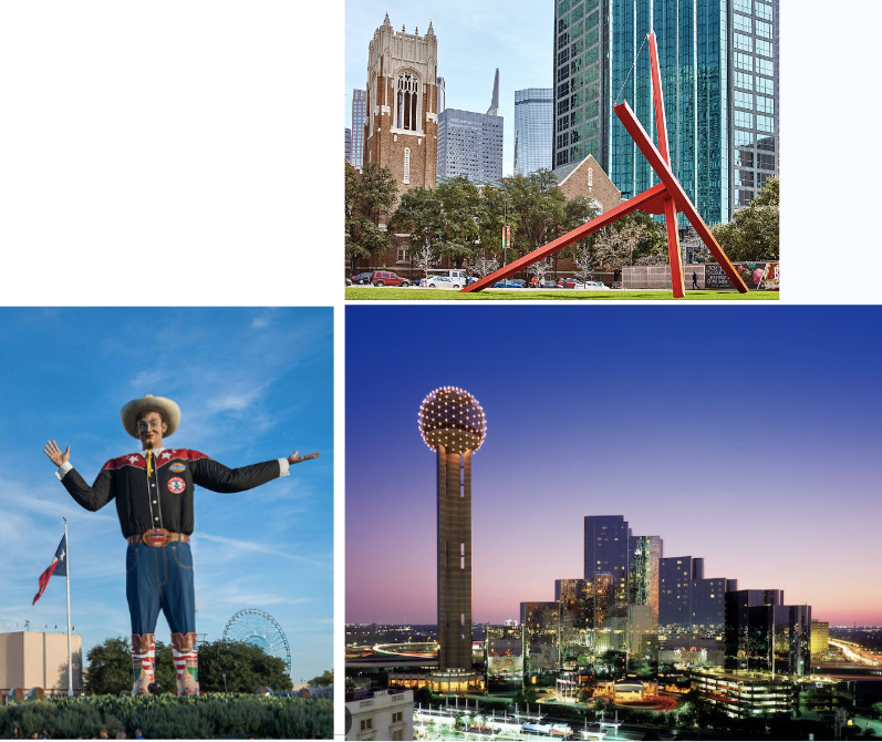
I started by identifying what Dallas, TX is known for. As I did research on the various aspects of Dallas, I quickly realized that Dallas has a heart built on various aspects, such as the Arts Districts, National Football team, State fair and so on.
All these different aspects brought together by one city gave me the inspiration I needed for this logo design.
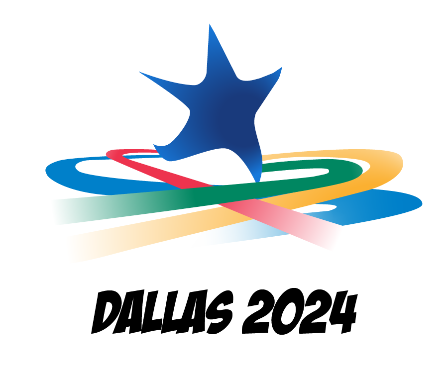
Logo Design (Draft)
Key Points and reasoning
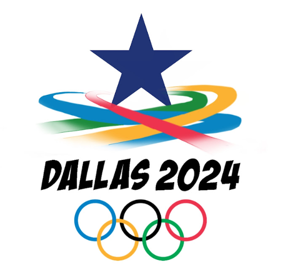
- Dallas star is instantly recognizable as a symbol, found throughout the city and in their sports teams
- Ribbons of color inspired by Dallas highways as they are what connect all the different elements of Dallas. I envisioned the star being like the city, the center of it all and what all the roads lead to.
- Colored in the official Olympic colors
I was suggested by designer, Norm Cox, to make the star look as if it were running which I implemented in the final design
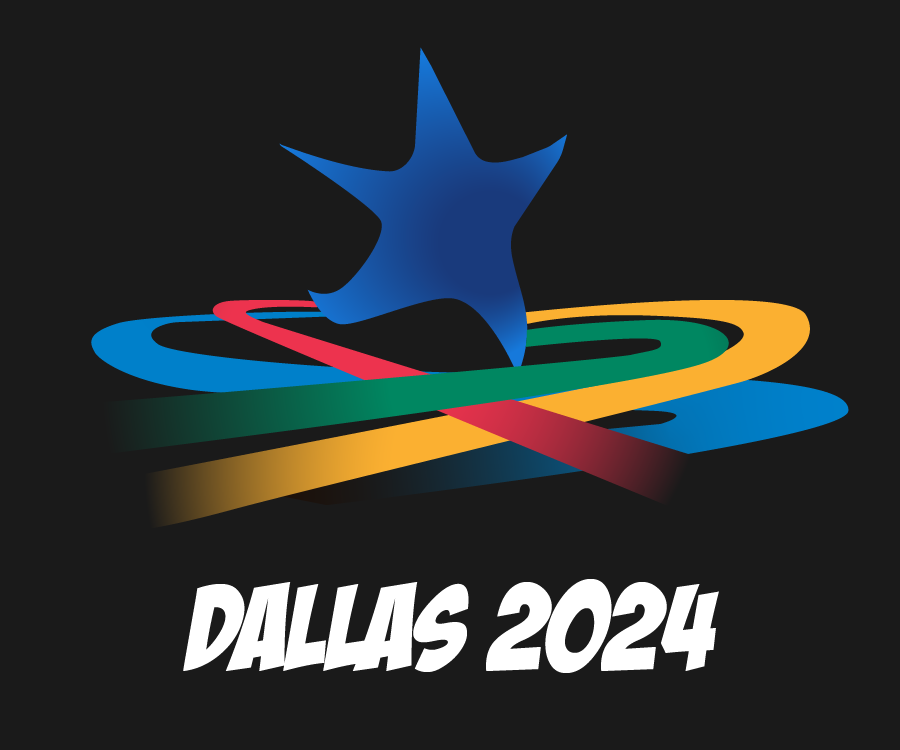
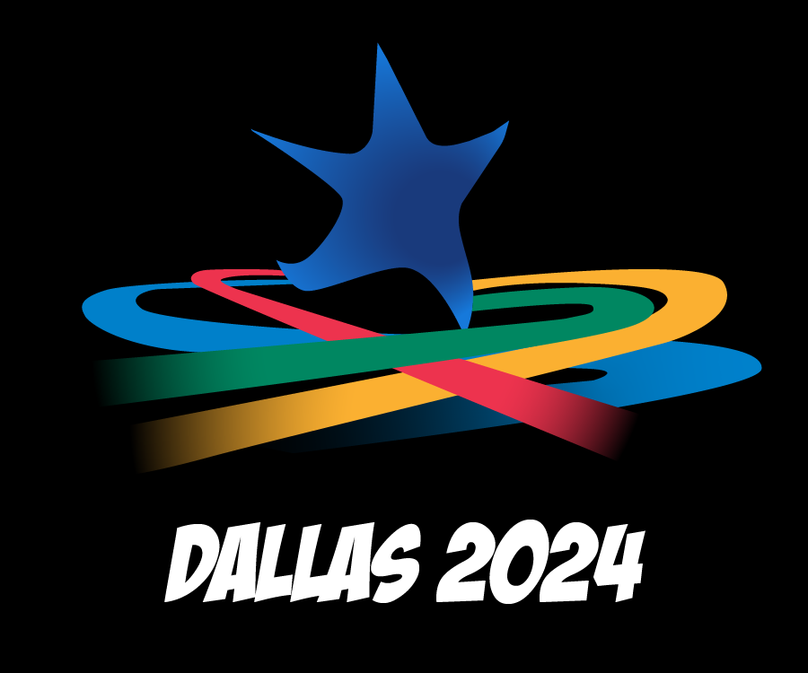
Final Logo Design
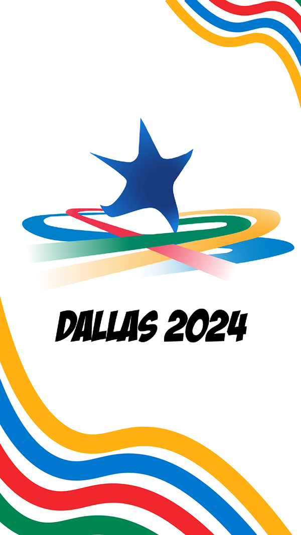
Logo Use
I came up with different ways this logo could show up in printed media such as a banner and a bus stop advertisement

I also began ideating how this logo could appear in television bumpers creating a rough storyboard below!